Plume, an original character
![]()
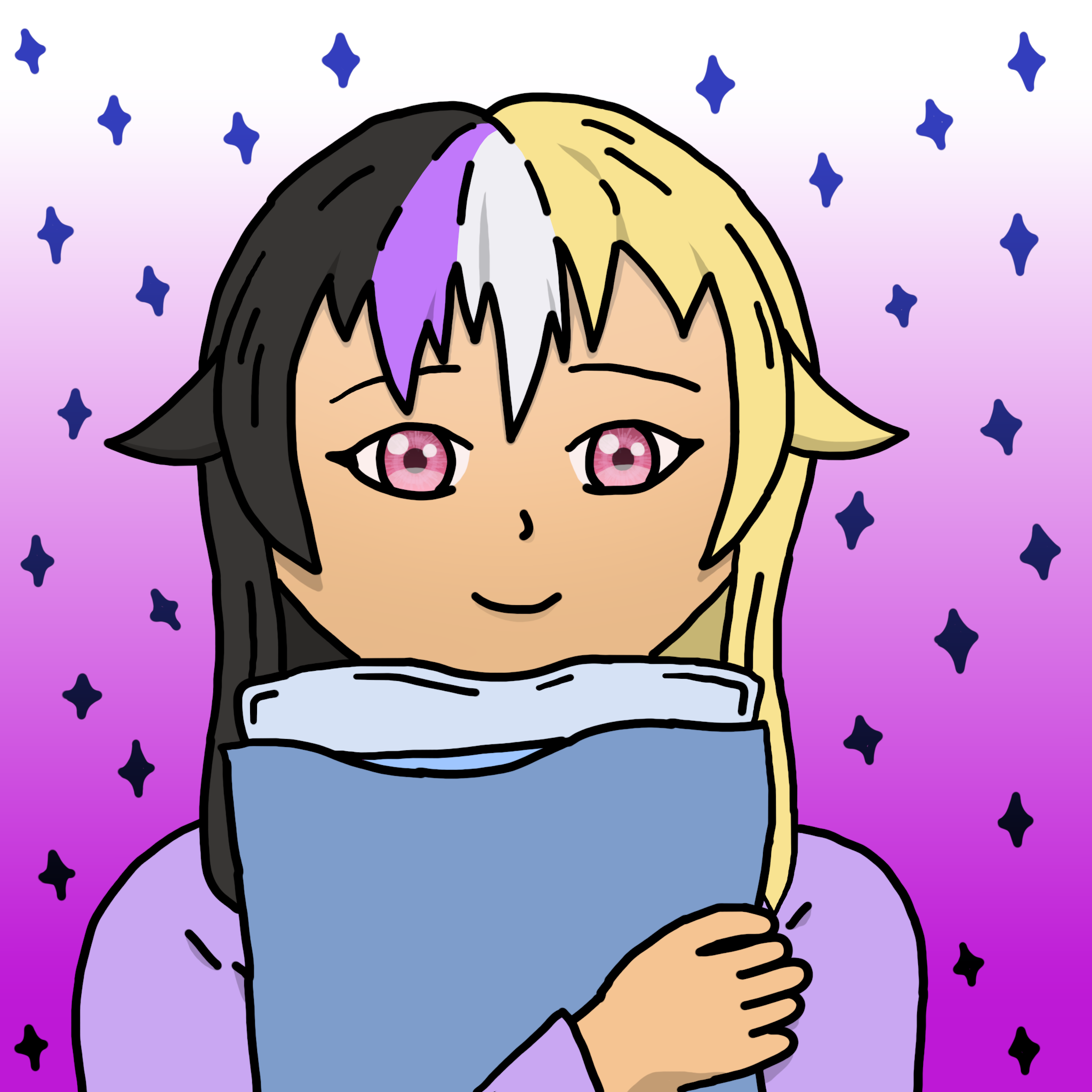
“Plume” © 2021 Komi Amiko, published under CC-BY 4.0 | version with background | download assets
Serious
Before I begin, I would like to say that, in my opinion, the English rule of putting punctuation inside quotes is stupid and it should not exist. Punctuation carries meaning, and if you want to quote some text exactly, you should not arbitrarily change the punctuation inside the quote because some rule said to for aesthetic reasons.
I have always been “bad at art”. I have tried a variety of forms of art, including 3D animation, digital painting, and music composition, and I have only been mediocre at all of them. I think, having had a taste of the process, even if it was only at the beginner level, I am more appreciative of art, knowing just how much work goes into it, and how difficult it is to produce something good. There are artists who put out amazing work at a level far above anything I’ve done, and I have a lot of respect for them.
I have had the thought that, perhaps, I do have the talent or capacity for art, but I lacked the tools to make use of that talent. I have long been aware just how much difference the tools can make, though I could not know for sure if, in my case, the right tools were all I needed.
Time spent on art is also an important factor. Artwork I admire often has many hours put into it, and I have not had that level of dedication to any art projects.
Besides difficulty finding the time and motivation to do art, I was also held back, for a long time, by fear. It was the fear that, even if I took art seriously and did my very best, I would still not produce good art. If I instead made low effort content, or even deliberately janky art, I would have an excuse if the result was bad. The criticism would not destroy my pride or crush my dreams. I’m not sure when this fear started to affect me, though I have gone a long time without being aware of it. I recognize it now, and though that does not automatically remove the mental barrier, I at least now have the mind to combat it.
Spur
Wanting to do art is great and all, but I need something to spur me to actually get up and make something. That came recently in the form of a Discord server with me and some friends running a contest to choose the icon for the server. We had just determined the name by vote, and now, I had the perfect opportunity to design a new original character (OC) to be our mascot and attempt a serious painting.
Meet Plume (they/them), the comfy pillow friend. I had an idea of the scene composition before I started, though most of the smaller details like the hair design I figured out somewhere along the way. In total, this drawing took about 2.5 hours. In the first hour, I drew 3 guide layers and the final outlines. I call them guides because I started way back in childhood with 2D animation with Flash and that was the terminology used, though I think in the world of painting they would be more commonly called rough sketches. These guide layers have no meaning in particular, I just started a new one when necessary to avoid drawing over the previous one. I first established the scene composition and layout, and then worked to the finer details, at this stage not caring so much about whether certain things would be visible. Finally, I drew the final outlines, which had the most detail. In the second hour, I did most of the colouring and shading. I gave each region from the outlines a flat colour, and then added in some shadows to give it depth. In the last half hour, I did the eye detailing, some finishing touches, and made a background.
I drew this using my laptop’s built-in trackpad since I don’t have a drawing tablet, and using GIMP rather than a program meant for painting. I spent 2.5 hours on the artwork, using 3 guide layers, and mostly flat colours. The inconsistent line thickness is because I had velocity dynamics enabled. I would like to use pressure dynamics, but again, I don’t have a drawing tablet, so I settle for another way to give the lines some flavour. Considering I usually do quick doodles with at most 1 guide layer and no colouring, this is well above the level of any paintings I’ve previously done. It’s also, I would think, well below the best I can possibly do, with better tools and more time invested. I’ve gone up some steps, but the ladder ahead of me is still tall. Some formal art education would help too. Others have already developed and refined effective techniques, and there’s no need for me to reinvent the wheel.
This was a good opportunity for me to break out of my shell a bit and try more seriously in painting, and I’m thankful that I had the opportunity. I’m quite proud of the result. I’m publishing the GIMP file in hopes that it may be useful educational material to others and to make it easier for others to make derivative works.
Though I talk a lot about results here, it’s also important for me to mention that I had fun with this. Having fun with art and enjoying it is important. Focusing on results and the pressure to achieve that comes with it isn’t very healthy. My reason to do art should be that I want to and I like it, not some sense of needing to meet expectations. This applies outside of art as well.
Confidence
The most important lesson I’ve learned hands-on from this experience is to be confident. In the early stages of an art project, it is easy to look at what you have so far and think “that looks like crap” and get discouraged from going further. It does get better, as you build on the work so far and refine it. As I was working on this painting of Plume, I wasn’t sure it would turn out well, but I kept going, and it all started coming together. In the end, it actually looks pretty good.
Eyes are one part I was particularly unconfident about. I had never done a proper eye before, always going for dots, lines, or ellipses because they were easier to draw and the style allowed it. I searched for references for anime eyes, found an image I liked, and did my best to copy it. It took me probably around 20 tries to get the shape right drawing on guide layer 2, and even then, it still looked a little off. I worried that it would look wrong in the final version. I fixed up some of the details in the final outlines, and it looked better. As I did the eye detailing, it started to really come together and look right. Tip for others doing anime style eyes: add detail! It isn’t that important what detail you add, but detail is needed to make it look alive. Flat shading looks dead.
I wasn’t really going for anything in particular with this painting, so it’s a bit of a mess lacking personality. With more experience, I should develop my own style. I’ve grown from this experience, and I’m excited to see where I may go from here.